Public Transportation.
Transportation was one of the few industries that I had not had the opportunity to work on, so when the founders of this company reached out, I was super interested in taking the project.
Project Goal.
Design a Platform for Public Transportation Agencies that included a UI/UX experience for Transit Agency Administrators, Dispatchers, Drivers, and Riders.
Problem.
Public Transportation Agencies are struggling to adapt to new technologies that would allow them to offer services such as on-demand.
Problem.
An all-in-one platform that connects all parties responsible for a successful on-demand routing integration.
Early Success.
The product was recently awarded a contract for a key Public Transportation Agency beating out competitors we looked at :).
Design Process.
Below you can find a series of images that explains how I went about creating this product.
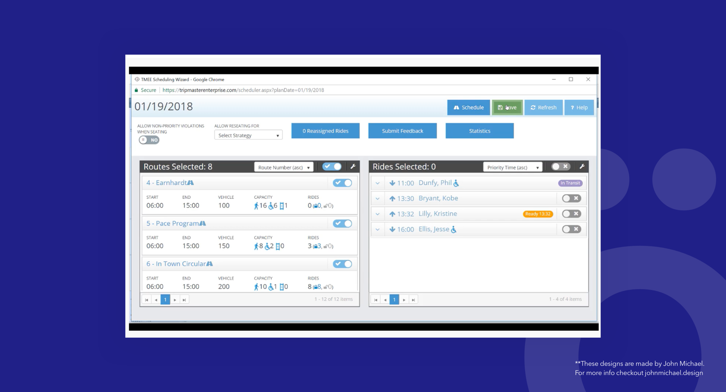
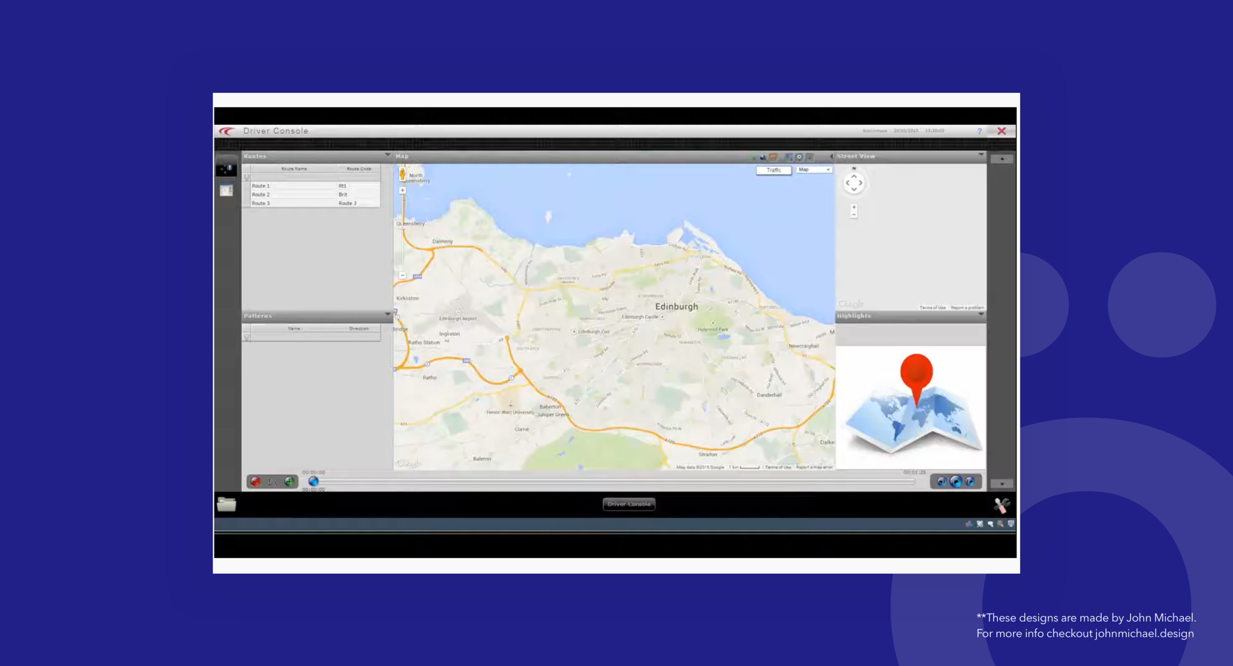
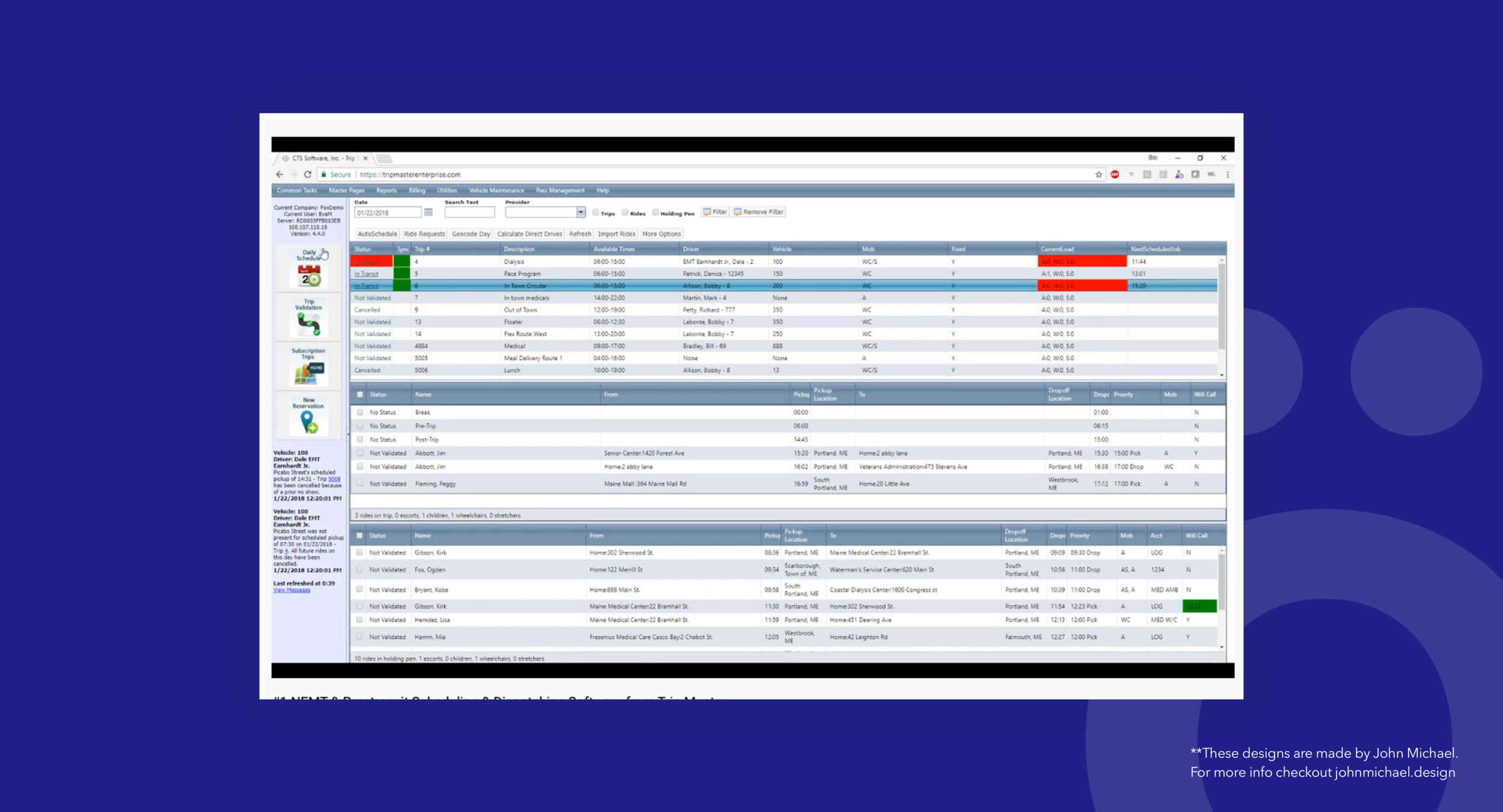
I began by wachting demos of currently existing solutions.
The interfaces at times felt cluttered and busy with small iconography. Components scattered and now clear hierarchy on where the user was in relation to the rest of the application.
The overall feeling was that most of these applications are very heavy weight and have a lot of functionality that can make the product seem and feel complex. This was something expressed to me later on in interviews as well.
AGENCY - I wanted to create something with structure so that I can start having conversations around what was important from a component and features perspective. Having this simple wireframe design in a prototype helped me get just that.
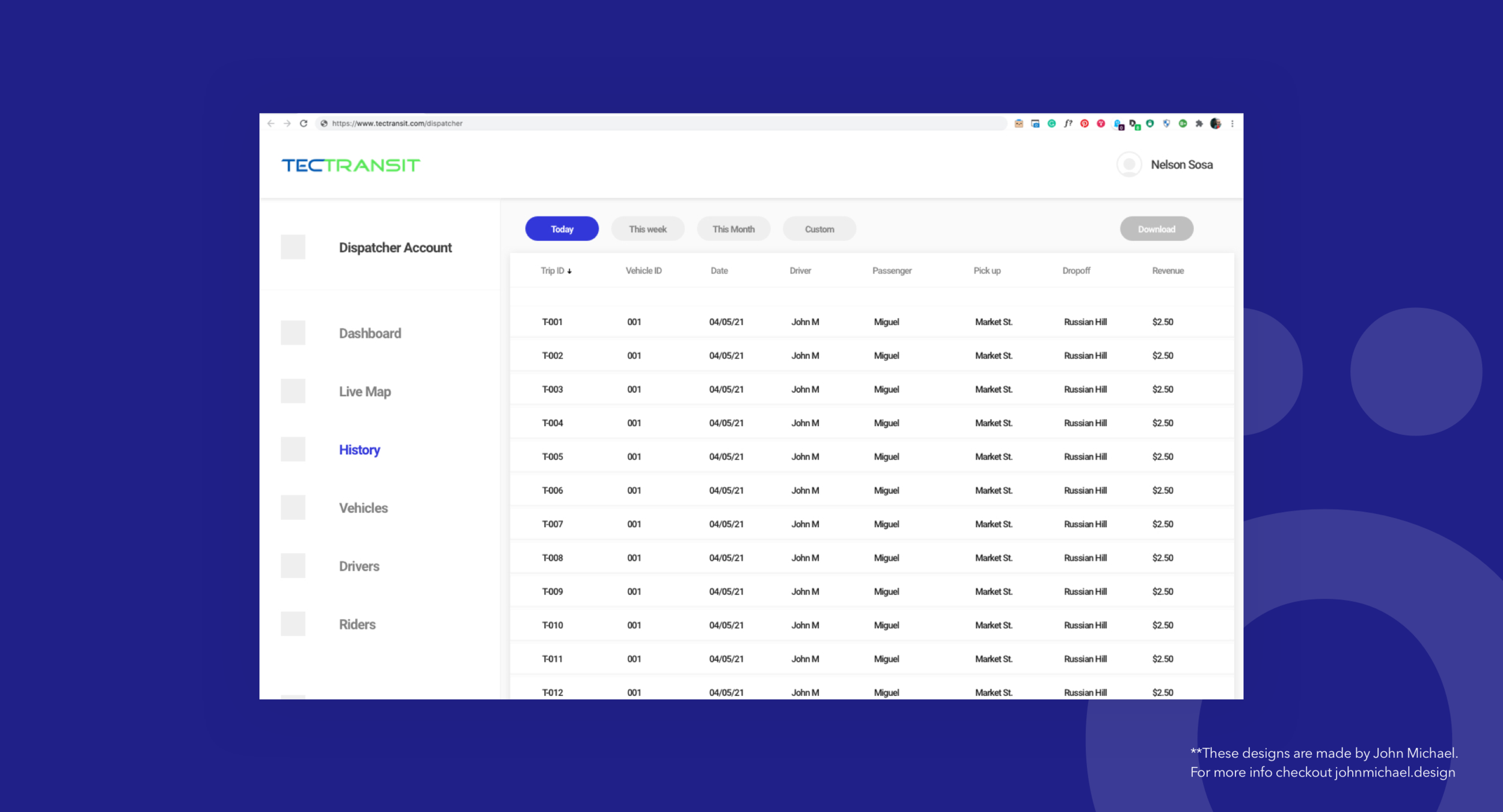
DISPATCHER - I slowly added more components to the wireframes to showcase the functionality and how we were planning to display certain information. Having tailored prototypes for each user type allowed me to get valuable feedback from each early on.
DRIVER - I slowly added more UI elements to the wireframes to try and maintain conversations around the product and make it feel as if they were looking at something real.
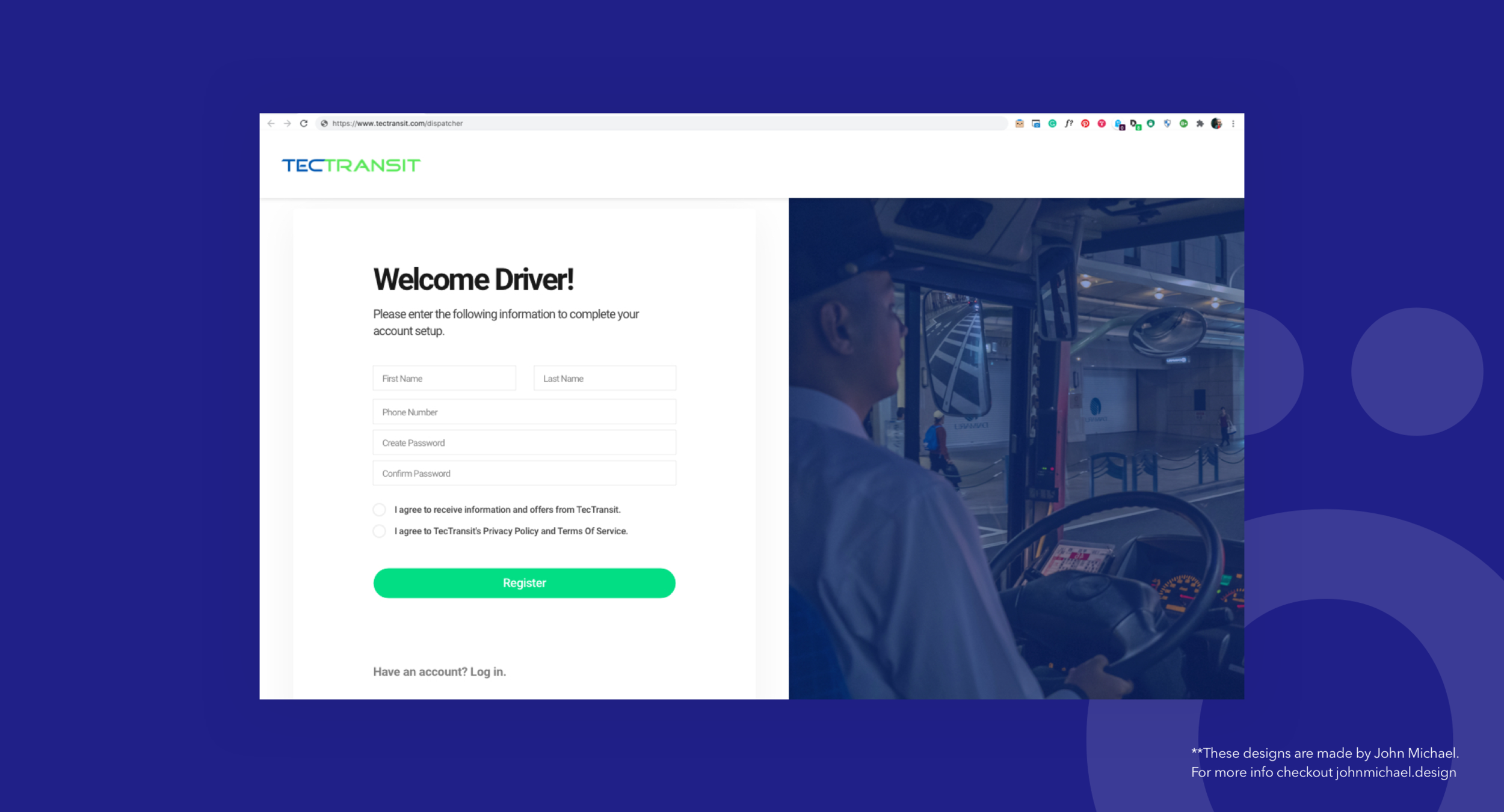
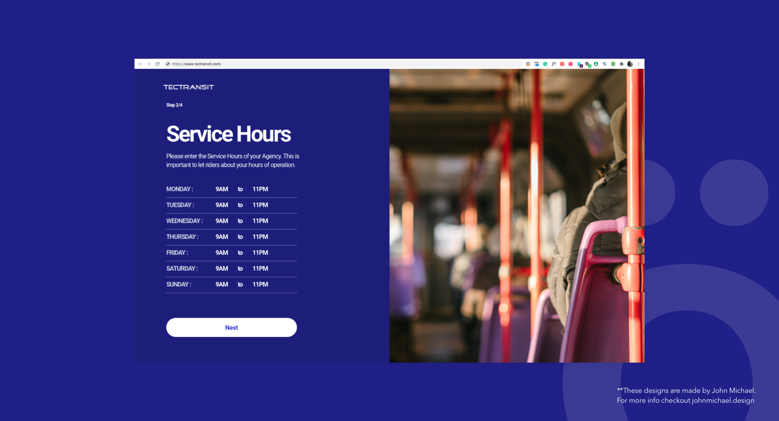
AGENCY - This screen is part of the onboarding designed for the Agencies. Through this process the Agency would provide general information about them so that we can setup their profile correctly.
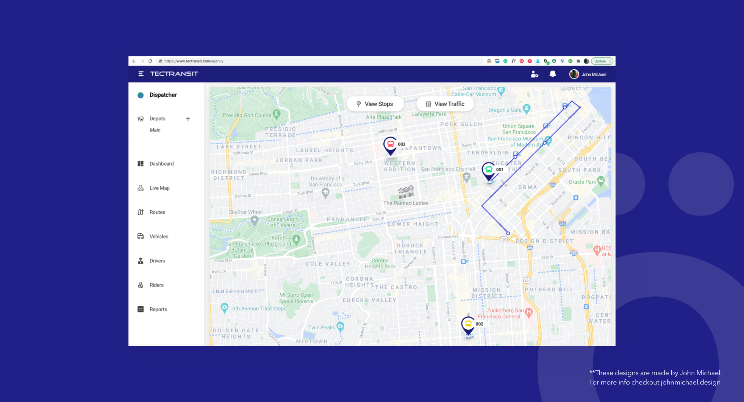
DISPATCHER - During conversations with Dispatchers, it was evident that the Live Map functionality was the most important for them. So I designed a Map feature that focused on showing them what was most important, which busses are on time, which ones are in danger of going out of schedule, and which ones are running behind.
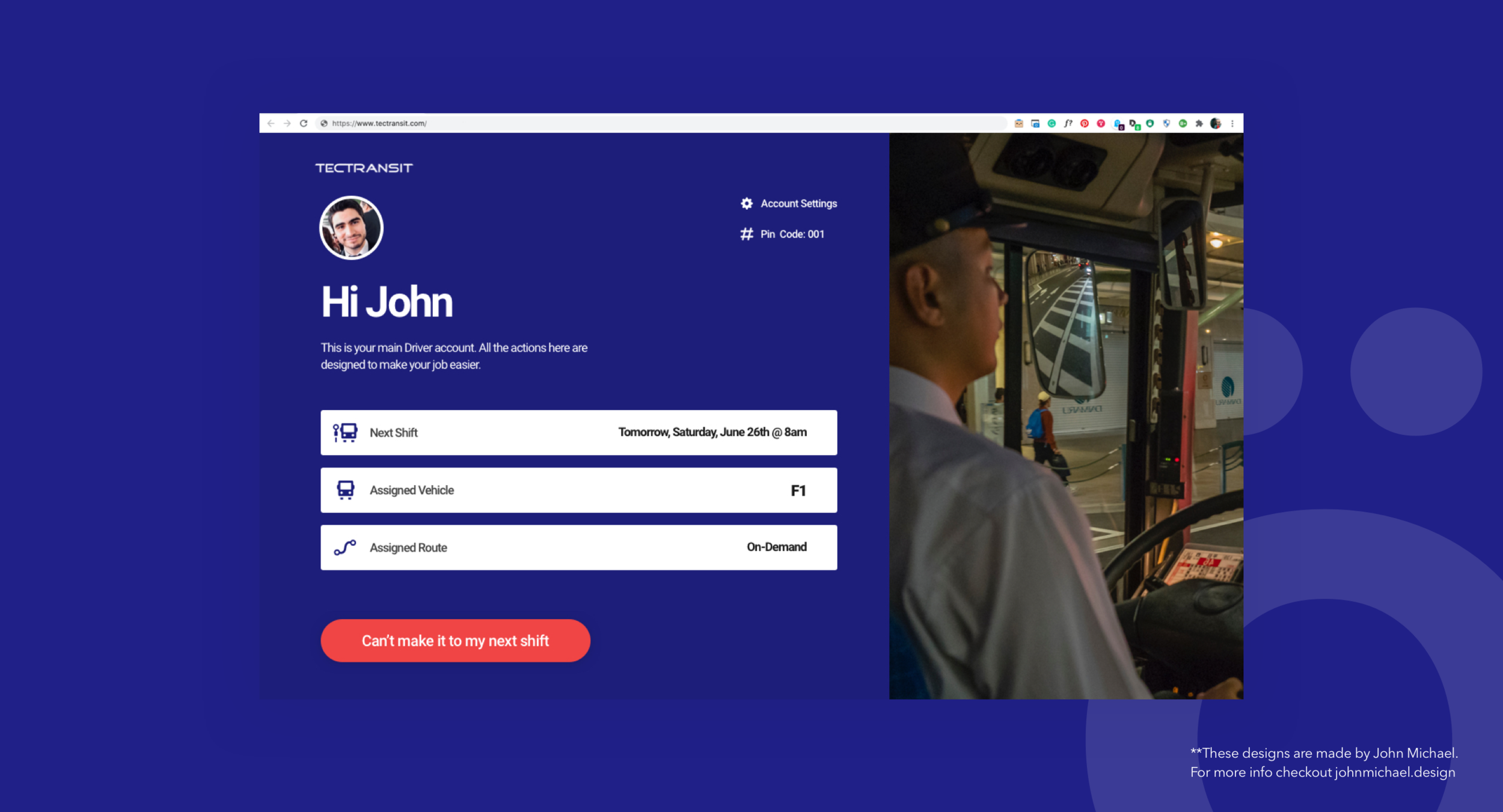
DRIVERS - During conversations, I picked up how a Driver's absence causes a big headache to the Agency. So the goal here was to create a simple web interface where drivers could update their status and let the agency know if they were not going to make it to their next shift. That way the system would trigger a re-assigned and help the dispatcher resolve the situation.
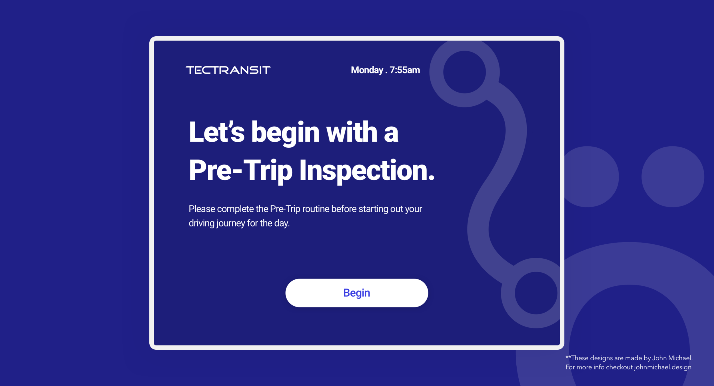
One of the biggest features of the Driver Tablet app, is the Pre-Trip inspection. This feature removes plenty of paperwork and written down report time by simply guiding the Driver through a series of screens and checkboxes.
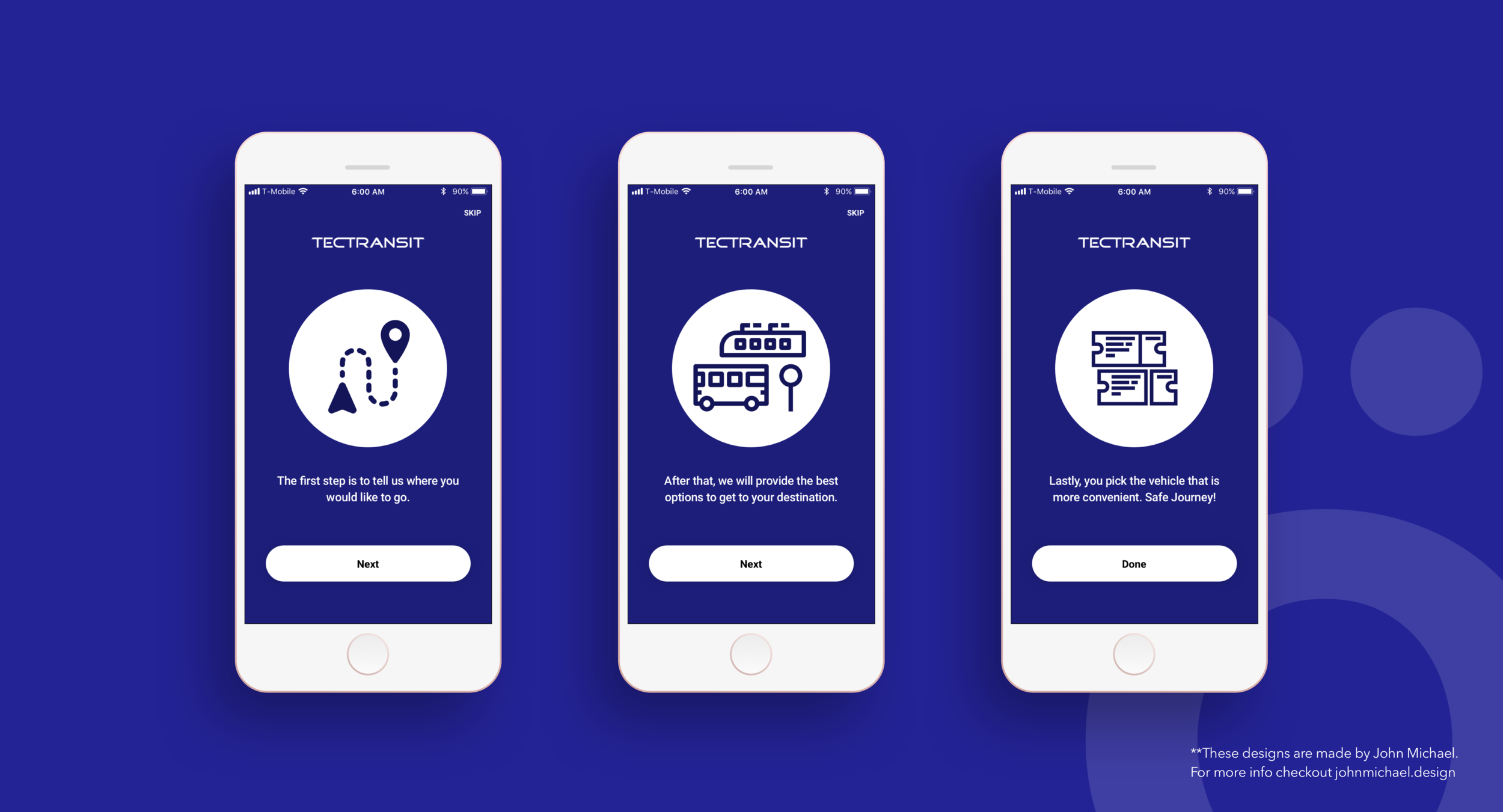
The tutorial screens for the Passenger app. The objective was to quickly describe how the app worked and ease people into the app.
Disclosure.
The vast majority of my work is IP protected and I can only show small amounts of my designs. In case you are interested in learning more about my work please reach out to me via email and I can walk you through the details of the process.
