A Bio-tech inteface.
“The people we work with can’t really read, so we need a design that doesn’t rely on text.”
I personally love opportunities that allow me to work on projects that have a humanitarian aspect and aim to have a positive impact on the world. So when this project came along, I couldn’t pass up the opportunity. I can’t name the company because they are still out there looking for funding and want to keep their strategy as private as possible.

Goal.
Design an iOS application that would work as the User Interface for a testing device.
Product Functionality.
The functionality was focused on specific processes the user needed to conduct in the collection, tracking, and analysis of samples.
“The target user doesn’t have high school education.”
I emphasize this because for me it was a first. Having to think about this deeply and understanding that the people interacting with my designs did not really know what the words on the screen meant was an interesting design challenge. It was also a smack of reality in the sense that, previous to this project I have been lucky to deal with clients in developed countries, and the thought of someone not knowing how to read had never even crossed my mind. So this project was great to get myself grounded and understand that there are people that are not as lucky to receive a good education. But that shouldn’t mean I couldn’t create something cool, interactive, and fun that could help people get access to clean water.
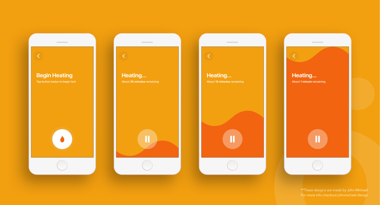
It was important to visually explain what was going on inside the hardware in our UI. I designed different ways to indicate how time was left and how the process was coming along so that the analysis was not stopped prematurely which would make the sample invalid.
Keep it simple and intuitive.
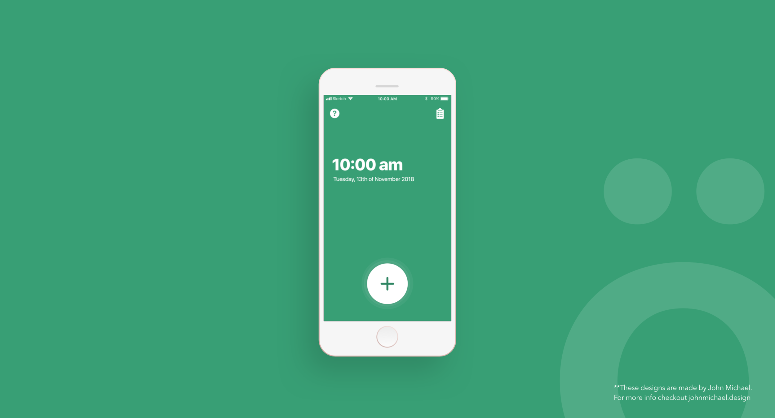
The app should be very intuitive to use and should not depend on text to understand how the app works. The design had to bluntly showcase the difference of each step with clear visuals that explained what was going on given that in order to conduct a test successfully there was no room for any mistakes as it would make the whole sample useless. To achieve all of this I spent a lot of time looking at iconography and trying to determine what are some global symbols that people understood the meaning in addition to icons that were very explicit.
Additional Requirements.
In addition to the requirements above, I had to create a design that catered for optimum performance.
The app was going to be used in remote areas where access to electricity was limited, so the app had to be lightweight and account for longer battery life.
I spent time looking at what are some of the variables that impact battery life the most. One surprising finding was “Font”. So I designed the app using iOS’ native font to waste any battery on that.
Closing Remarks.
The project was completed in 3 months and I provided assistance for the asset delivery and implementation.
Beyond the Designs.
A few months after my designs were implemented, the startup won a startup competition and a medical research grant.
Update 2022.
I had the opportunity to re-connect with the team and they are doing great! They are still using my designs as the core part of their Ui/UX for their application :).

Disclosure.
The vast majority of my work is IP protected and I can only show small amounts of my designs. In case you are interested in learning more about my work please reach out to me via email and I can walk you through the details of the process.


