Global Shopping and Delivery.
I was contracted by Grabr to help design new parts to their application including landing pages, features, and later on improving their iOS app.
Early Work.
During the first couple of months, I worked directly with the marketing team creating different landing pages to promote campaigns.
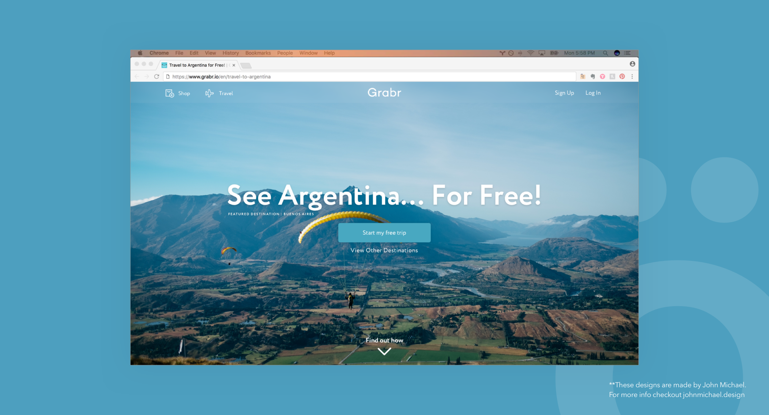
I put together this design in a Landing Page program and created a funnel that would collect important information from travelers interested in going to Argentina.
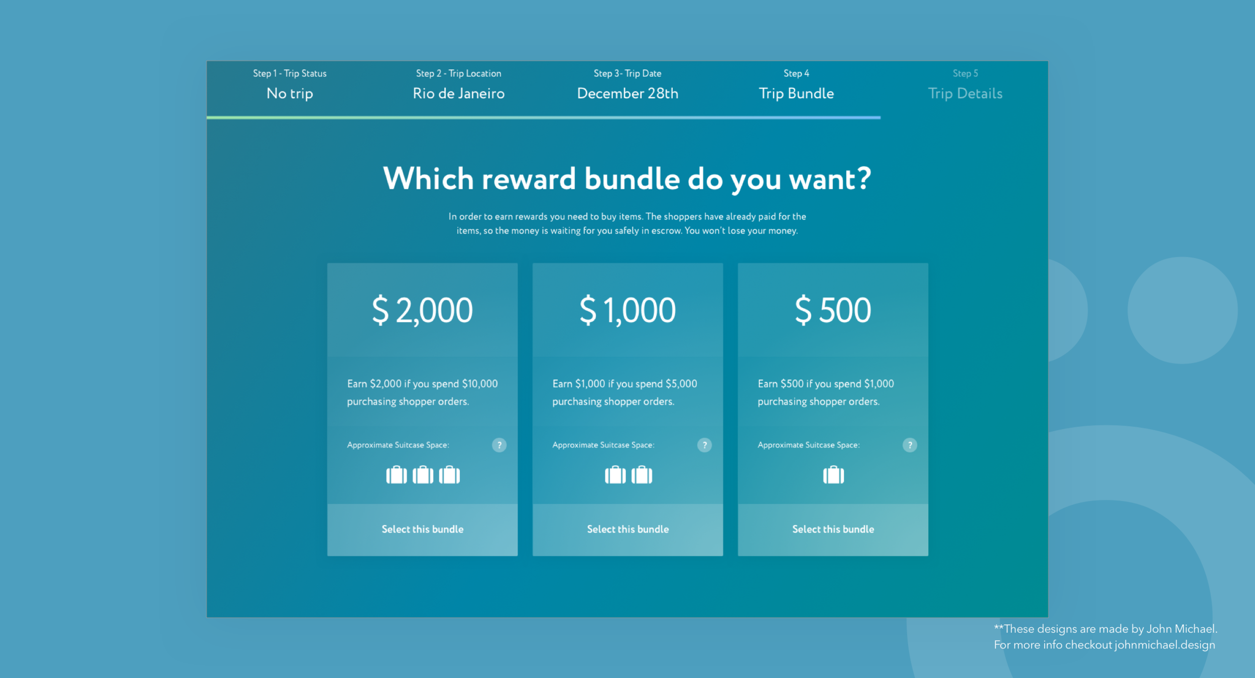
Example of an onboarding flow design that collected all the important trip information from a traveler and then convert them to the platform as a registered traveler.
Main Application.
After various successful marketing landing page designs, the startup rewarded me with a chance to work re-designing their main landing page.
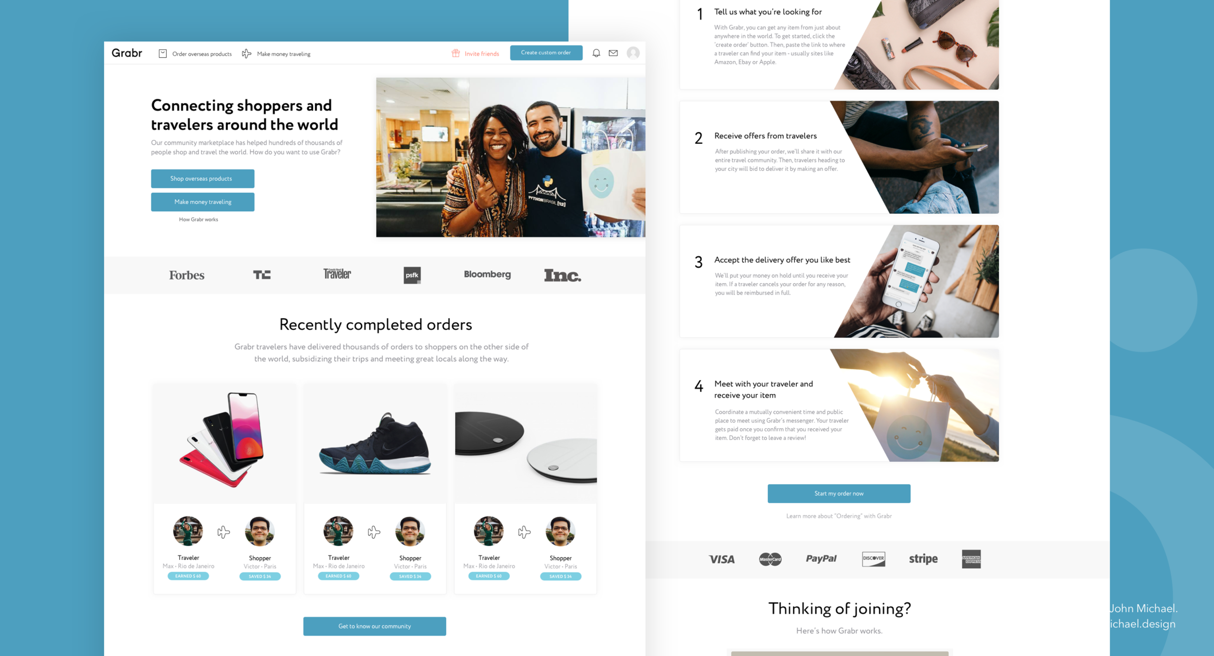
After various iterations, we arrived at this solution. The goal was to provide as much information as possible about how the product worked. I tried democratizing this process as much as possible so I essentially got almost the whole team involved to provide their insights. The final design was done in collaboration with the other UI designer in the team, Arina.
iOS App
I was given the opportunity to work on the iOS application and create a strategy around small improvements that could be done without overwhelming the engineering team.
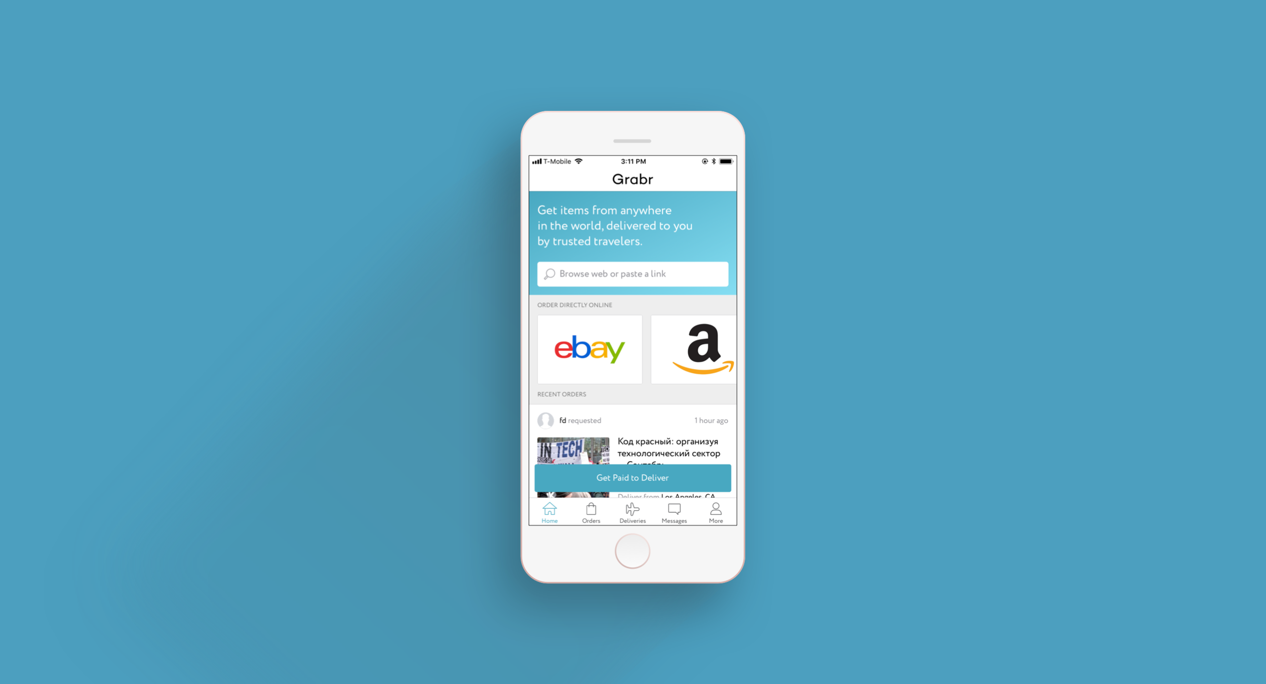
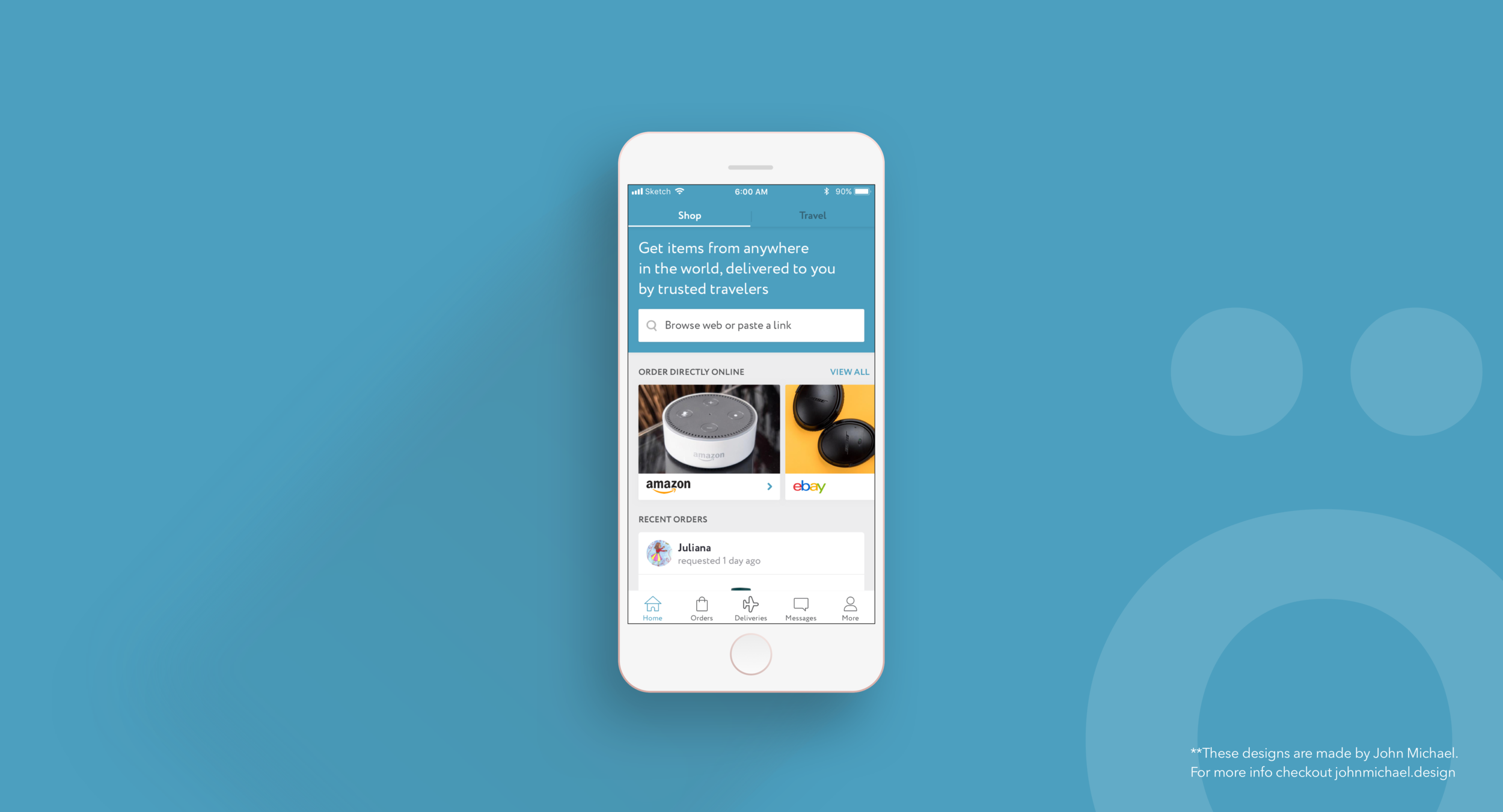
This image represents the state of the iOS application when I was contracted and before we started doing any updates.
Initial Step.
The most important thing was to get a solid understanding of what the founders expected from the iOS application and what role did this product play as one part of the platform.
Process.
After understanding expectations, I was able to create a plan involving a series of design changes targeting areas that needed improvement in addition to addressing user feedback.
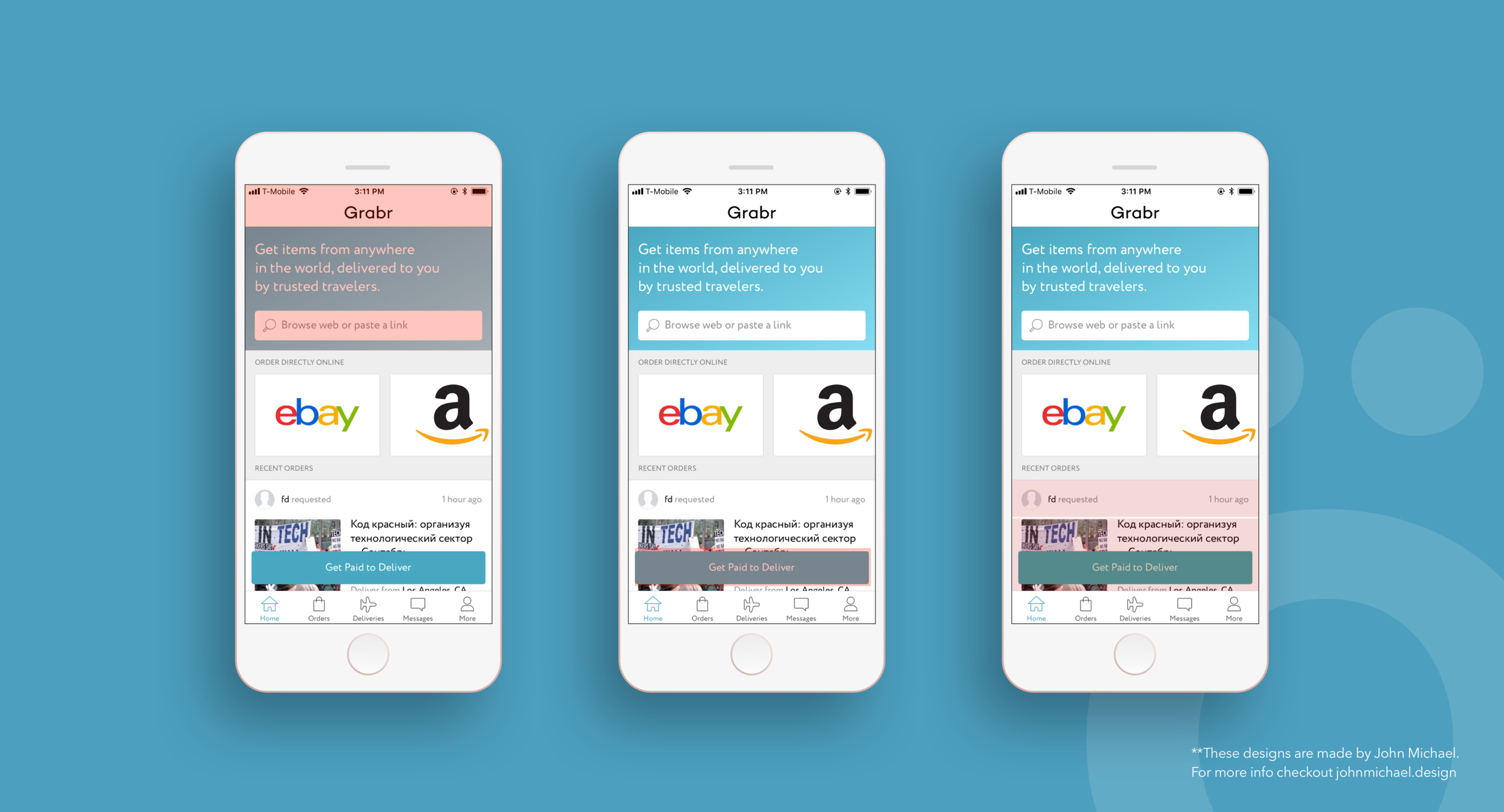
This is an example of the areas that I pointed out we had to address in the application as part of my review process.
Strategy.
For the initial stages my strategy was simple, use UI/UX updates that would make the app easier to understand and simpler to use.
For example.
The app’s home screen had various CTA’s meant for different types of users. This was leading to user confusion about what the app was about and how it worked.
Solution.
We introduced hierarchy to the app using a toggle that represented the two main functions of the application. Now when a user opened the app he/she would clearly see it was about two things: shopping and traveling.
This was the change we introduced to bring more organization to the application which allowed us to then create “themed” feeds targeting each users type separately.
Results.
After the release, we saw a spike in overall engagement and average time spent.
Furthermore, users started flowing better inside the app which led to a 5x increase in conversions.
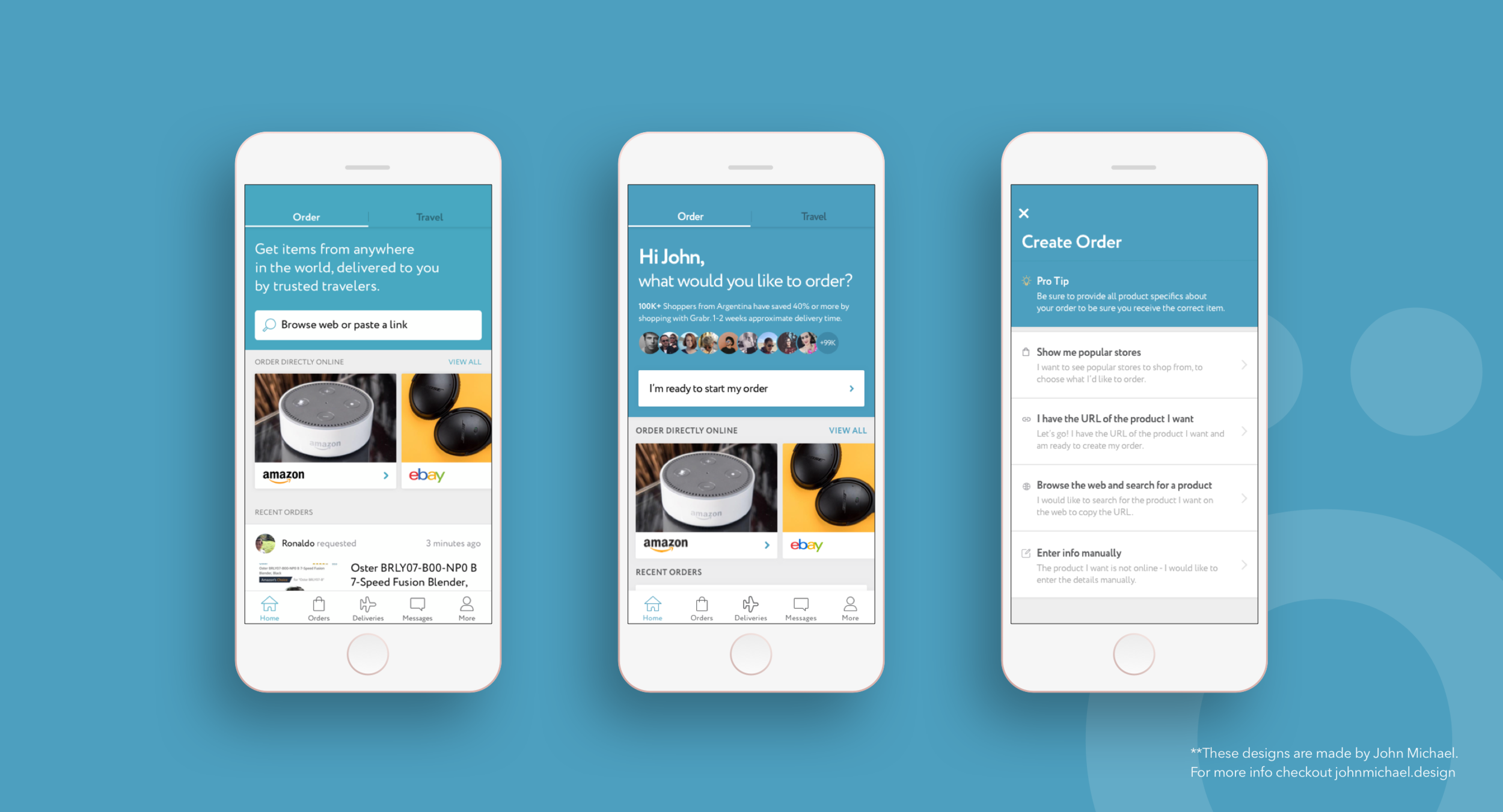
This was another change we made to the application. During user feedback sessions we noticed some confusion with the top section of the app. The description and the “Browse web” section was not triggering them to put an order. So I worked on a design that focused on personalization and order creation. And added users that had made orders recently to create some trust. Then by breaking up the create order to its own screen, we could educate our users on all the different ways they could make an order with us.
Beyond the updates.
Beyond adding more structure to the application, these changes allowed us to create tailored experiences for each user type.
We worked on a series of changes leading to a 10x increase in user interactions.
iOS app Performance.
After a series of small updates, tests, and bigger changes the iOS app started improving its numbers. By the time I left, the iOS app was their best-performing product.
Closing remarks.
This opportunity allowed me to learn a lot and work in a collaborative environment. The fact that my designs were being effective gave me a lot of confidence to take on bigger challenges.
Disclosure.
The vast majority of my work is IP protected and I can only show small amounts of my designs. In case you are interested in learning more about my work please reach out to me via email and I can walk you through the details of the process.